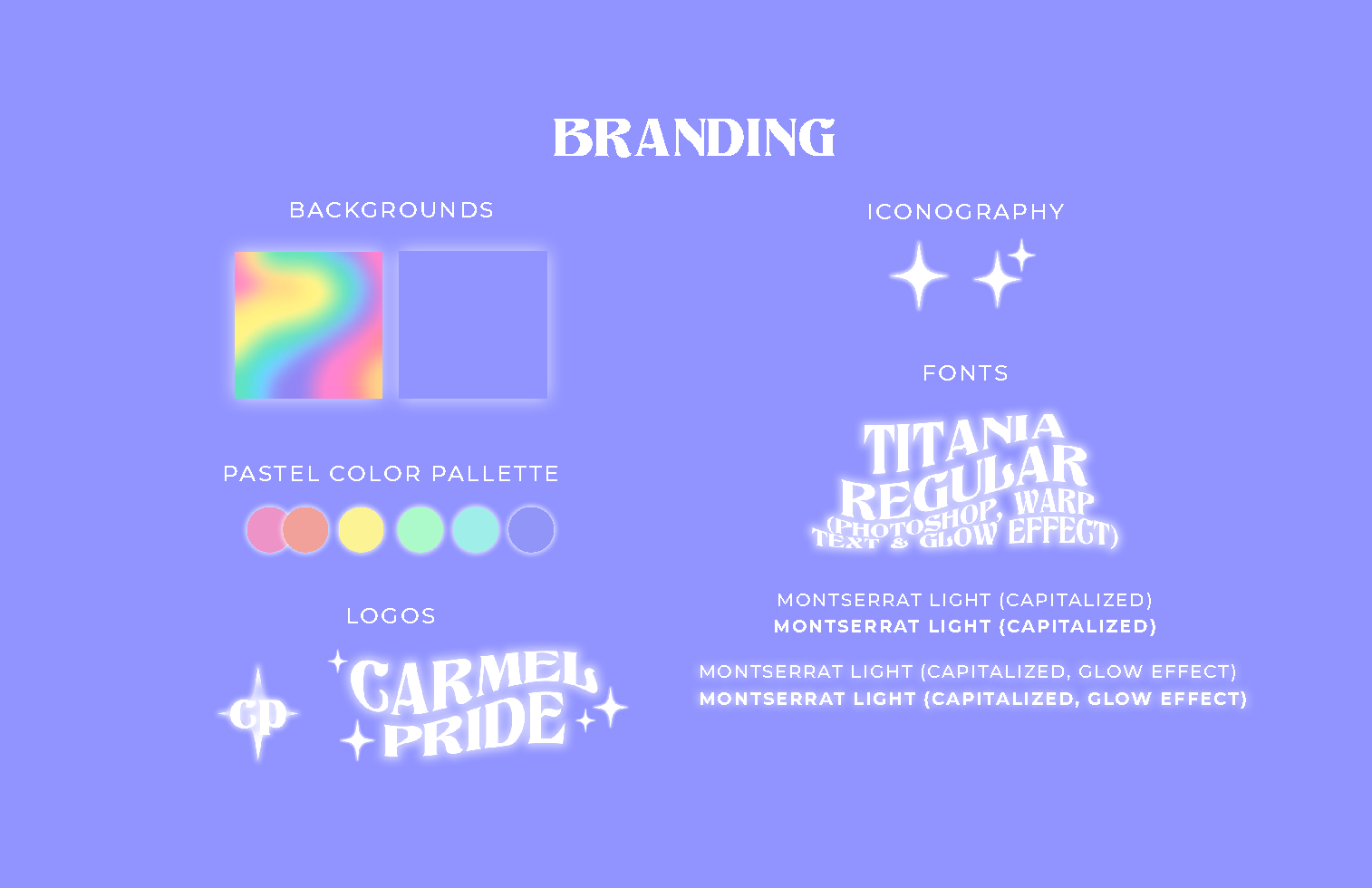
Within a completely student-led organization to put together my city's first-ever LGBTQ+ Pride event, my role was to craft and maintain a youthful, marketable brand identity that would cater to young LGBTQ+ peers in our community and build our organization's credibility to achieve partnerships with local businesses and ad spaces—eventually helping attract 2,500+ guests & 60+ organizations to our event. This brand identity was designed to ensure we had eye-catching flyers, ads, merchandise, and shareable Instagram posts to spread the word about the event effectively, and was inspired by the symbolic rainbow LGBTQ+ pride flag. This project means a lot to me, and our community's positive response to the event convinces me that it truly helped change the culture in my city to be more welcoming.
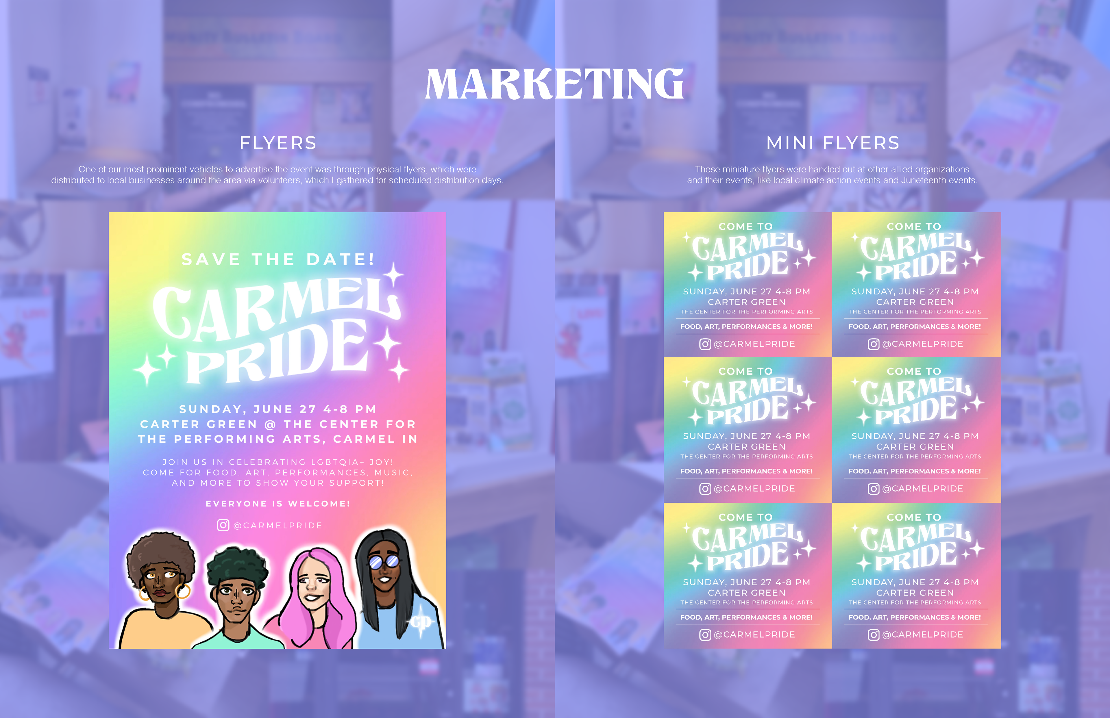
Note: the illustrations of the four figures on flyers and banners were made in collaboration with a local queer artist, and do not belong to me but were used with consent.